INPRS Public Site
The public site must help visitors understand what INPRS offers in plain language, then move them toward the secure member/employer portal where they can actually act on that information.

Empathize
Known User Pain Points
Over the year 2025, most comments had complaints about:
• Logging in
• Not user friendly
• System down
• Changing personal information
• Finding tax documents

Define
Problem Statement
INPRS website users expect to have their personal retirement details easily accessible.
Plus, they expect digestible, generic retirement plan information. Instead, they are confronted with complex navigation and language. This results in cognitive overload of users, high call volume for INPRS advocates, and low satisfactory scores.
Ideate
Idea #1: Update/Restructure the public site itself
Simplify the navigation bar
Clearly separate member and employer
informationOrganize information by plan, not topic
Idea #2: Create a dashboard that bridges the gap between user, INPRS, and Voya
Provide clear, accessible information that captures the users’ attention
Customize news, forms, and handbooks based on
the member’s planGet enough data for Phase 3 Member Portal using Salesforce
Design Decisions
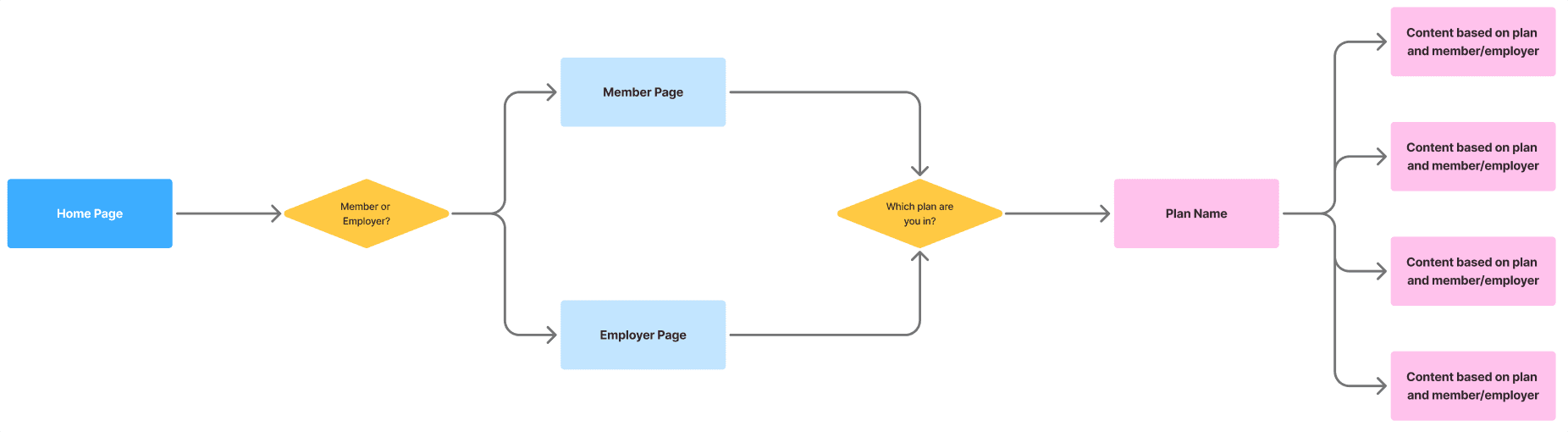
Reduce Choice Overload
Hick's Law: Too many choices lead to confusion
We created funnels for users. We tried to reduce the number of decisions that need to be made all at once. People tend to get overwhelmed when they are presented with a large number of options.
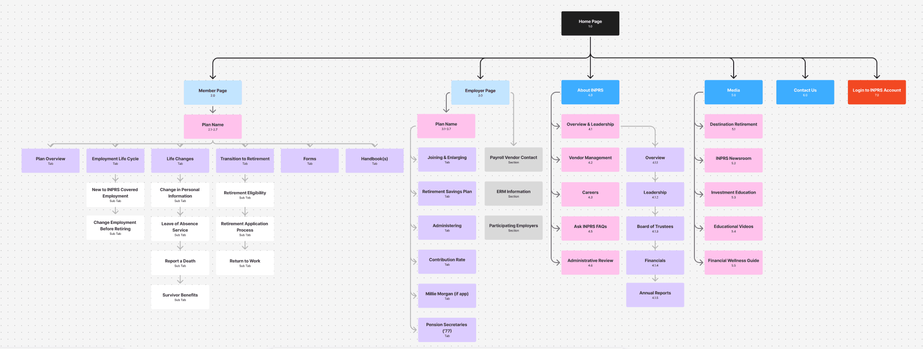
Before, many lists made it hard for users to find what they were looking for. Now, information is grouped on plan pages instead of by topic. It is evergreen information in simple, digestible terms.


Before
After

Match Between the System and the Real World
Jakob Nielsen’s 10 Usability Heuristics
Plain language and clear navigation help members feel less intimidated by the important decisions they need to make. Our readability scores were too high.

Our Solution
Not many people refer to their retirement account as a Defined Benefit. More people could understand it as "pension". We laid out each plan with its structure and related it to how it is used in the real world.